A-boards, pavement signs, chalkboards, you've seen them - we all have. With promises of 2-4-1, witty puns and hand-drawn messages, they're apparent on almost every high street in the UK, and for a good reason – they work.
Quite to what extent they work, however, and how they work is something that most wouldn't, and don't, consider. This effectiveness is particularly apparent in the independent retail business community. These signs plague streets with repetitive messaging and cheap plastic and aluminium 'clip-in' style hardware, the like of which is more appropriate adorning the floor of a cheap photo-printing shop, rather than a nascent business trying to entice a new customer base.
Why is this? It's because every small business owner does the same thing - they think about having an a-board about two hours before they're due to open their doors for the first time, panic, jump on Google, and opt for the cheapest, most weatherproof example in existence. They send in a couple of pictures, along with copy (usually trying to cram in as much information as is possible) and let the company supplying the hardware design and provide the advertising too! A-board goes out, never to be thought about again. Big mistake.
Before we moved to Cambridge to open our first shop, Alex and I were working in London. I was working for DDB in Paddington, a great advertising agency, and Alex hopped around working for Quintessentially and Brand Exchange, respectively. Working at the Ads agency afforded me time around some fantastic designers and art directors, along with some great strategists (or planners as we called them). We worked closely with marketing departments from huge companies and had the challenge to use communications to help them achieve their business sales objectives.
In that kind of environment, you quickly get a nose for what's right and what's wrong. You realise that there's a vast effort required to research, structure and communicate effectively with consumers. As a brand, you need a tone of voice; you need brand colours, you need a logo, a look, a feel and it must all sing from the same Hymn sheet. Your customers need to feel and experience your brand in a particular way to make it believable. Remember - every brand starts as an idea, you give it a name, and over time you tell stories about your brand. You start with friends and family, and then you move to the public. Before you know it your idea, your momentary invention exists, and it exists in peoples heads. What picture they form can be shaped by how you communicate to them.
Let's not dive too far down the branding rabbit hole for now. I wanted to give you an idea of the framework around which we approach our communications.
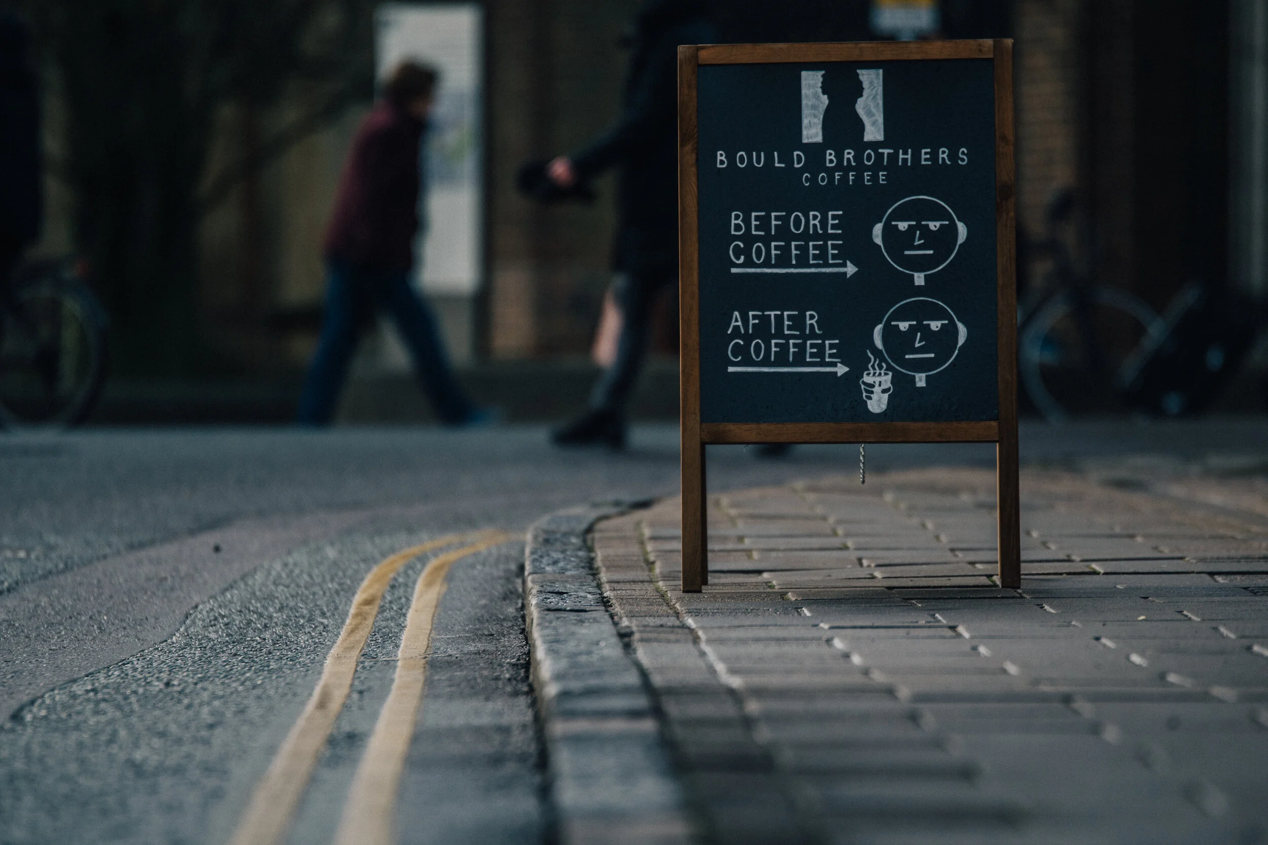
Believe it or not, this extends to our a-boards. We've had three iterations of our a-board, each an improvement on the last and we are still looking to make it better and more effective. The first was small, white on black chalkboard with some version of a witty hipster joke scribed by yours truly (see image 1 below).
Fast forward... It takes us six months to realise that not only is it entirely off-brand, but it is precisely what everybody else is doing - shame on us!
For sign number two, we hypothesise a couple of things: one, we need to go bigger! Our first shop is positioned about ten meters off the central pedestrian zone, and that's a big deal, especially for customers that don't know anything about us. Why would they venture down an otherwise desolate street? So we need something physically larger and easier to read. Two, we need to use a more guerrilla style of marketing. We need colour, punchy messaging and need to place our modest British sensibilities in the dustbin.
Thankfully, by this point Bould Brothers has already accrued a hefty number of five-star reviews on Google, Tripadvisor, Facebook and Yelp and so there we have our unsubtle, in-your-face stats, ready to brandish. I've ordered the biggest a-board I can muster, and some coloured chalk pens prepared to channel my inner 'Art Attack.' Sadly, we don't have an image to share with you showing the new, punchy messaging, but we've included a pic of its precursor sign (image 2).
Almost overnight we see a jump in sales - a sustained increase that is! We'd hypothesised that bigger and bolder would get the job done, but we didn't think we'd see a 10% spike overnight - we were thrilled!
We never quite felt right about having a sign that shouted so loudly about how many 5* reviews we had - it just wasn't us. It had always been our goal to deliver understated excellence, and to do it with a level of elegance. We felt this sign missed the brief considering what we were trying to achieve as a brand. Don't get me wrong, we were happy it was working, but we wanted to achieve the same results (or better), and wanted to do it in a way that felt more authentic.
So, we hatched a plan - a complete redesign. We needed three things: one, we needed someone else to do the shouting for us, two, we needed to show people what an authentic Bould Brothers Coffee looked like, and three, we needed the design to be elegant, professional and on-brand.
In image 3 you can see the final artwork that emerged. We had the privilege of working with Vogue, Vanity Fair and Conde Nast Traveller through the months preceding this signs conception. We felt we had a perfect opportunity to include their brands alongside ours - they could do some of the shouting for us, so to speak. We also chose to take pictures of coffee we actually serve, no beauty shots here. Just one magic, poured by Alex, photographed by me. A considerable amount of thought went into choosing where the photo would happen, with what camera, and most importantly what lens, and then, of course, at what time of day would the light favour an excellent product shot - also a consideration. We made sure to include branding so that customers could start to get used to seeing our brand next to the colours we chose, and so that they could begin associating our brand with beautiful coffee. Finally, we wanted the design to be clean, contemporary and not too cluttered in terms of messaging.
The more astute marketers amongst you will be shouting about a 'calls to action*' at this point, I'm sure. It was our feeling that if we were relying on our a-board to convince customers to try us, we were doing something wildly wrong with our other marketing communications. The job of your a-board is not to convince someone walking past your store that they need to come in now; instead, it's a statement - 'here we are, this is what we do', but do that clearly and authentically. Sure, you will drag some people in from the street because: 'it looks like that place might make good coffee', but in reality, it's more about people not missing you, and understanding who you are, quickly.
We still have a long way to go where our signage is concerned, but so far we're happy with the results we have achieved. We use an iterative process of innovating and testing - the thinking we take to most decisions we make in the business. We research a concept, draw a hypothesis together and then test it and learn from the results overtime - more on that style of decision making in the future!
This blog was a bit of a long haul, so thank you if you've made it this far!
If you're a business owner and you have a black and white chalk sign, consider changing it, and measure the results. If you're an interested consumer or thinking of opening a retail business, then take a walk around, look at different signs and think about the ones that appeal to you - and which don't? Which ones communicate clearly? And which ones give you a sense of 'brand' for the business they represent? It's a fun game if you're into that kind of thing!
*Call to action = marketing jargon. In the simplest terms, it's an instruction to a consumer. Once you've won them over with your 'wonderful advertising' you want them to do something - 'Call NOW on: XXX,' or 'Go to www.calltoaction.com to find out more.'

Image 1
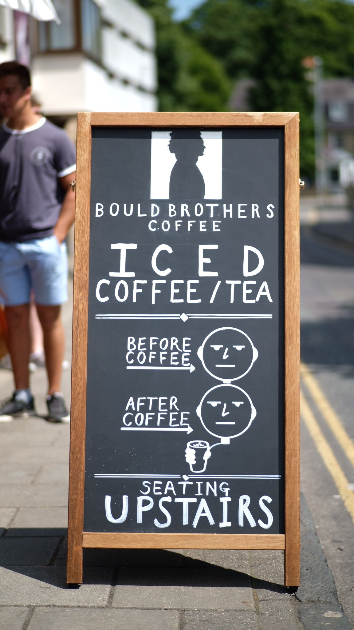
Image 2

Image 3

Image 4